From signature to piece.
EVOLUTION AND STYLE.
Signature's evolution.
Before Juan Carlos filled the city with his nickname, the only graffiti in Madrid was political and, outside of the city, since the last decade, some brands such as Zaleski Moda and Ulloa Óptico qhat took over rural buildings or rocks close to the roads to advertise their businesses with brush paintings.
It's not easy to label a style without having another peer to compare it to. This happens with any original fenomena. Previous to Muelle there was nothing similar and what came after him, in the short and medium term, followed his footsteps.
Muelle's signature experienced different transformations throughout its history, both on the letters and the style, until it became the distinctive brand that everybody knows.
UPPER CASE

In his beginnings, by the end of the 70s, Juan Carlos simply signed with the six letters of his nickname with sticky upper case letters, usually with no ornament or accompaniment, even though there are traces where a skull was drawn next to his name.
Before disappearing, the upper case letters underwent a slight transformation consisting of the elimination of the straight angles, giving it a more modern look and with a personal touch. They no longer were just any letters.
LOWER CASE
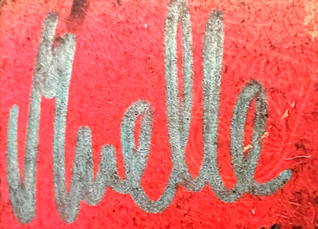
The next step was the transition of the letters, de mayúsculas a minúsculas a excepción de la «M». This way the signature started to be done in just one line and with a quick execution. This change possibly was caused due to the abundance of signatures made in the streets, looking for the required speed to make them without being caught.
Already with this format Juan Carlos started to make the signature together with an R inside a circle ®, symbol used in the trademark registries.
Spiral
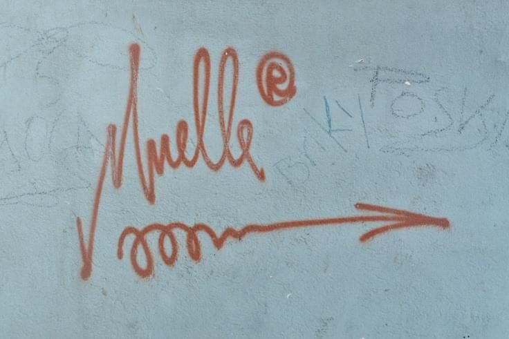
When he added to the signature his inseparable spiral ending in an arrow, the format was consolidated. As time went by, the point of the M was stretched and became sharpened. The arrow was more extended and pointed up.
This time was possibly Muelle's most prolific period, in terms of being seen, in marker, on any street surface.
Curvature
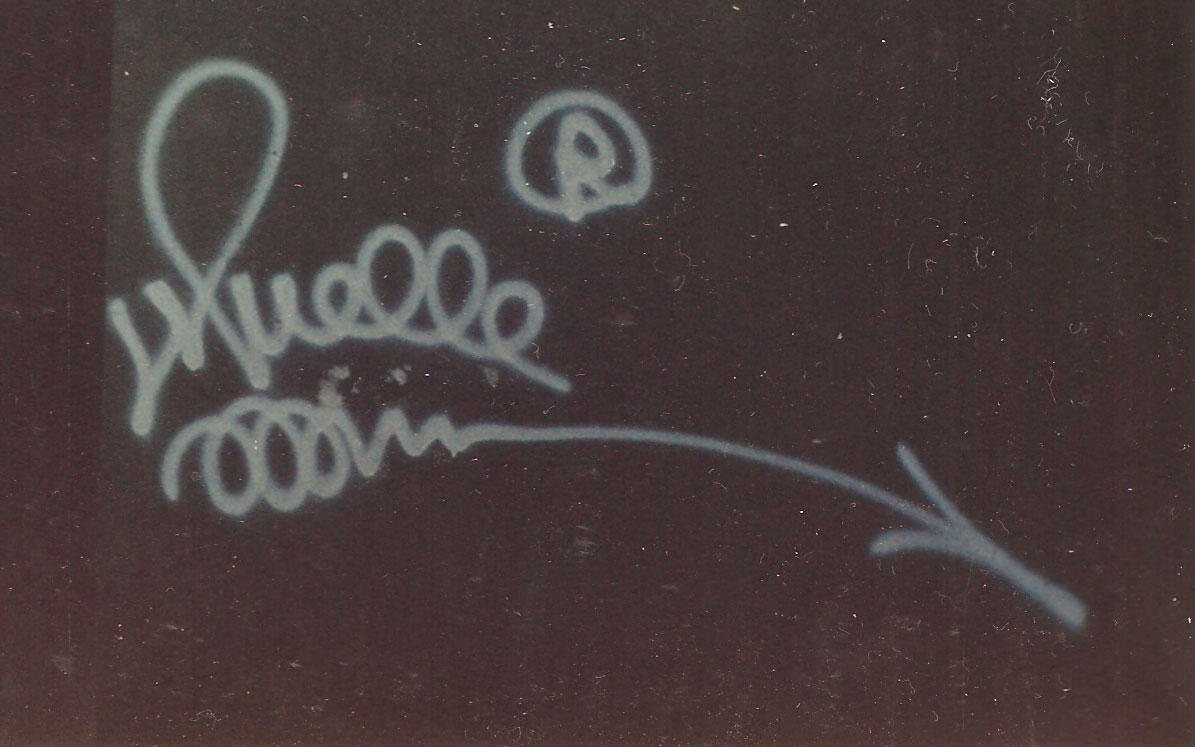
In the second half of the 80s the signature kept on evolving. In his continuous styling it experienced a change in trends that smoothed its shape.
The arrow started to bend down, from the M grew another spiral that never stopped growing and that, together with the rounding of the rest of the letters, they grafically turned the word itself, nickname and Juan Carlos Argüello's signature, into a muelle.
Style and structure of the piece.
When taking a look at the different variations he used to develop the design of his piece, one can come to the conclusion that he created his own style.
He started off by adding a shadow in a single line with a different colour from that of the signature, adding some contrast. Next, he just retouched it a couple of times to widen its thickness, completing it with another inner line as brightness.
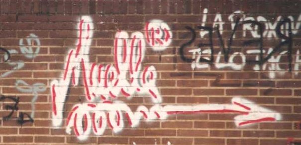
As an intermediate step he punctually made some pieces with a freehand outline, some without colour and some filled with a different colour adding volume to the piece. They worked because of their big size, someting new for their time, but with an irregular finish.
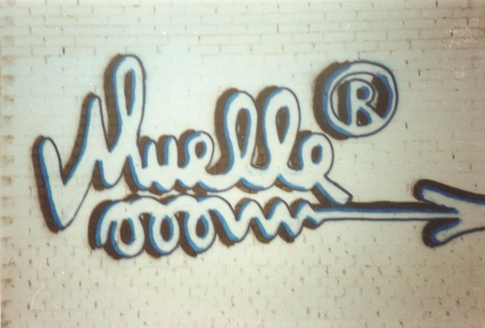
As an intermediate step he punctually made some pieces with a freehand outline, some without colour and some filled with a different colour adding volume to the piece. They worked because of their big size, someting new for their time, but with an irregular finish.
At this point, he created what would mark the structures of his pieces from now on. He made parallel lines separated from the original one, creating as a result a double signature with no filling colour, which gave it a skeleton appearance. This was the first aproximation to the final structure of his piece.
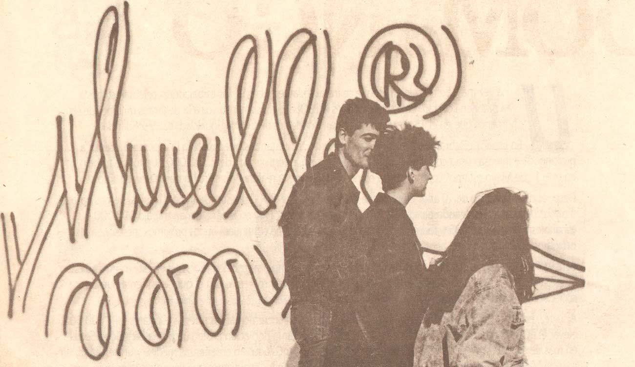
Lastly, using that as a base, he closed the ends of the parallel lines and coloured the interior, drawing the exterior in a different colour, usually black, extending it on its lower right side or upper left side like a 3D effect, and going with a white brightness in the opposite side of the shadow.
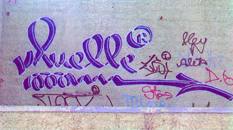
Lastly, using that as a base, he closed the ends of the parallel lines and coloured the interior, drawing the exterior in a different colour, usually black, extending it on its lower right side or upper left side like a 3D effect, and going with a white brightness in the opposite side of the shadow.
Once the style and the structure of the piece were consolidated, he perfected the fillings with colour gradients and ornaments, he played with triangulations and roundings of the shape and changing the lines and shadow colours, making countless designs around the same base.
As years passed by many have tried to label the style of Muelle and his followers, it has been named flechero, it has also been labelled as grosorista, but the most correct term is to call it Madrid's Native Graffiti, created by Juan Carlos himself without any external influence, and that together with the Brazilian Pichação is one of the few graffiti styles that differ from the New York style.

